
WILLIAMS + CO
KEYWORDS:
SOPHISTICATED | MINIMALIST | SOFT
FIELD:
BRAND IDENTITY | WEB DESIGN | PHOTOGRAPHY | COLLATERAL
INDUSTRY:
CONVEYANCING
Looking to make her new business stand apart from the sea of traditional conveyancers and feel connected to her roots in Clare, South Australia, Tanya from Williams + Co came to us for a full brand identity design package, with a new website and accompanying brand photography. With a desire for minimalism and simplicity, we crafted a sophisticated brand identity that feels connected to the South Australian landscape while having a soft, feminine yet professional edge.


PROJECT GOAL
Showcase Tanya’s local connection to rural South Australia with a minimalist and professional brand identity that includes simple line art.
CHALLENGE
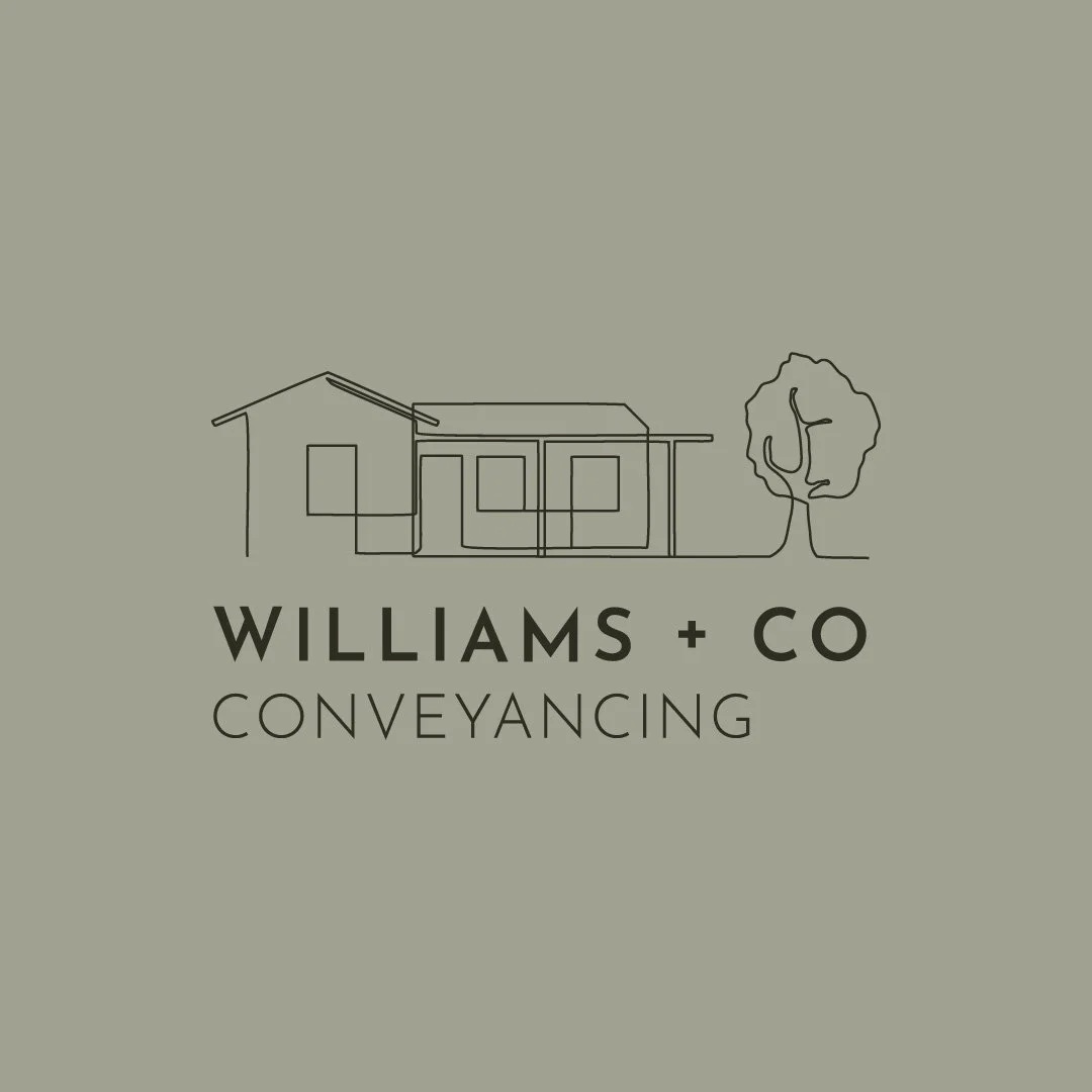
The main challenge with this project was to make Williams + Co stand apart from other conveyancers in the Adelaide and South Australian region. Looking into other conveyancers, we noted common elements of colour choice, graphics and typography that all tended to lean in a corporate, masculine direction, which we knew wouldn’t align with Tanya’s goals for her business. Many brands used house iconography within their logo, typical for a business within the conveyancing and real estate sector for audience recognition, and we knew that Tanya was keen to have a house within her logo, so including that without making it too similar to what was already out there was another hurdle.
With her explicit design for the inclusion of line art, we knew the parameters of this project and could get to work crafting the identity of Williams + Co.


SOLUTION
Seeing Tanya’s vision for her brand, we were inspired by the styles of Scandinavian design, with its minimalist approach and clean lines that connects beauty with functionality with simple yet elegant design and muted colour palettes. Choosing soft, earthen tones and working through a range of line art styles, from more geometric and architecturally-inspired, to a contemporary continuous line drawing, we began to see Tanya’s vision come to life.
For us, the typographic style of Josefin Sans reflected the linework in architectural drawings, and its clean sans serif design brought a modern edge to Williams + Co that provided a little bit more than a geometric sans serif, with its low x-height and variety of weights.
We knew Tanya wanted to stand apart from typical conveyancing design, with its corporate design and typically blue and red colour schemes, introducing a more feminine feel, but to retain recognisability, we kept the house motif, including a stylised gum tree to illustrate her connection to South Australia. The continuous line work softens the brand and contrasts against the modernity of the typography with its gentle corners, and once coloured in her muted palette, provided that feminine identity and elegance we desired.


OUTCOME
Working with Tanya, we created a stunning brand identity that truly reflects who she is and what she wanted for her business. Expanding that out to a clean website design and supplemented with a brand photoshoot that captured Tanya’s warmth and down-to-earth energy, it was a pleasure to see her vision come to life.
She had a clear vision for what she saw for Williams + Co, and we are so happy to bring that vision into reality and see this new business take off.


CLIENT LOVE
“I really wanted to reach out to thank you for being so fabulous for my photoshoot. I was exceptionally nervous and you made me feel so comfortable and I actually had fun doing it (who’d have thought??!)
It has been an absolute pleasure working with you all!”
Tanya Williams, Founder of Williams + Co


