
Adelaide Beauty Lab
KEYWORDS:
STYLISH | DISCRETE | WARM | REFINED | MODERN
FIELD:
BRAND IDENTITY | COLLATERAL
INDUSTRY:
BEAUTY
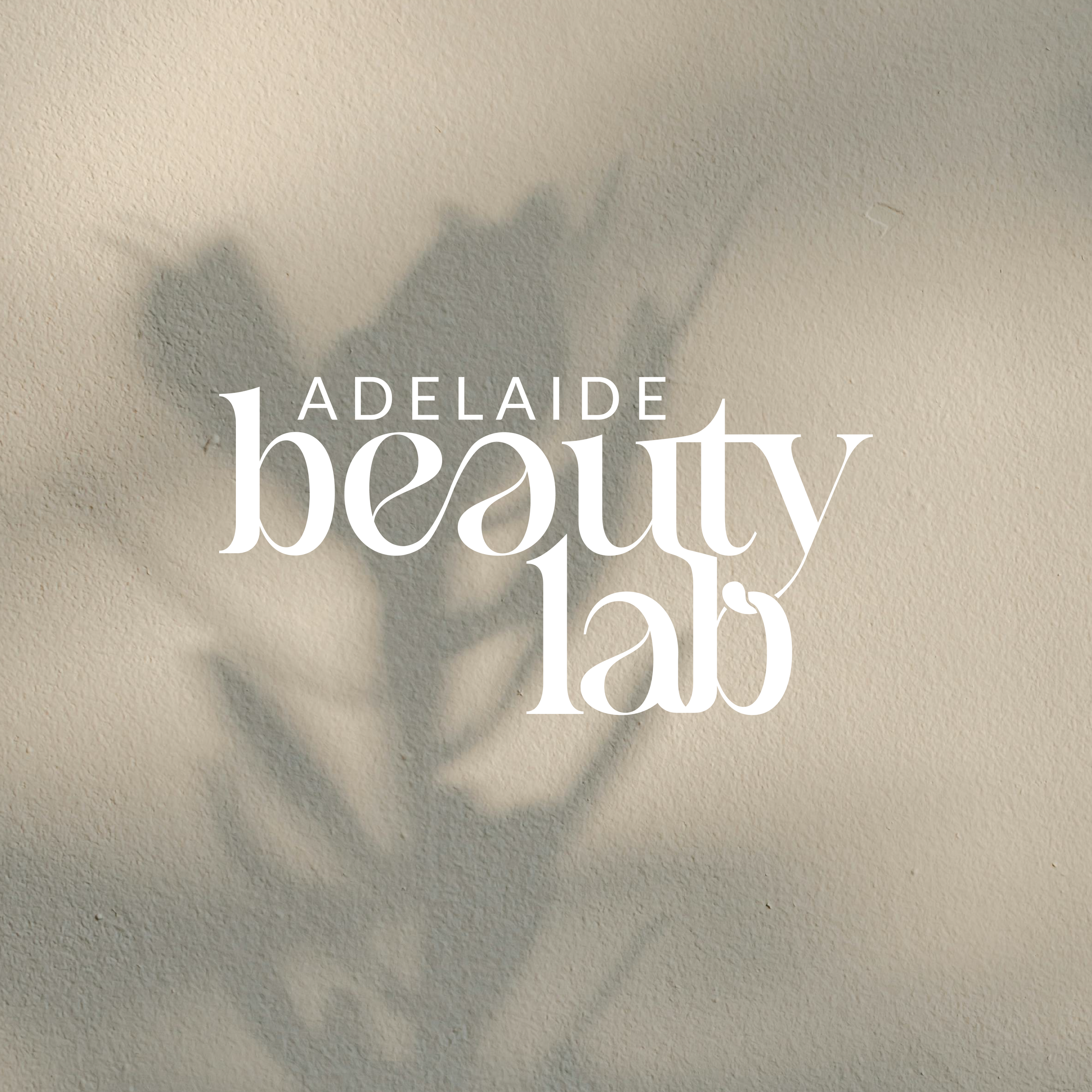
Mila approached us with a desire to reshape the concept of beauty in Adelaide, seeking a modern and stylish brand identity that would authentically reflect her vision and capture the essence of true beauty from within. Drawing inspiration from soft curves, flowing letterforms, and earthy tones, we crafted a fresh brand identity for her under the name "Adelaide Beauty Lab"—a name that’s both memorable and perfectly encapsulates her work within the Adelaide beauty community. This project was a rewarding blend of simplicity and creativity, marking our first venture into Adelaide's beauty industry and allowing us to explore contemporary design trends with a more feminine touch.


PROJECT GOAL
Redefine and elevate Mila’s vision of beauty within Adelaide by creating a modern, distinctive brand identity for her business that spoke to both the aesthetic and emotional aspects of beauty, while also aligning with contemporary design trends.
CHALLENGE
Entering a new industry is always an exciting challenge for us as designers—an opportunity to explore what’s working, identify current trends, and find ways to approach things differently.
For Mila, the challenge was translating her vision and essence for Adelaide Beauty Lab into a cohesive visual design. She wanted a modern, minimalist approach with a typographical logo that had a feminine flow without being overdone.
With a longer brand name like "Adelaide Beauty Lab," finding a way to incorporate all the elements into the logo while maintaining simplicity added an extra layer of complexity to the project.


SOLUTION
Overall, we knew that Mila’s vision was neutral simplicity. From our initial mood-board, the flow created from interconnecting letterforms with variation in line weight created a soft blend of femininity and presence, allowing us to find a slightly bolder typeface. Supported by a capitalised modern sans serif, this typography pairing encapsulates modernity and flow, creating a serene brand identity that is at home within a beauty salon.
Stacking each word slightly off-centre creates a modern look and brings all three parts of the brand name closer together in a more cohesive fashion.
The deep earthen palette promotes relaxation and calm without becoming overly feminine, yet would support the neutral pink of her current place of business without clashing, which was a worry for the client.

OUTCOME
A simple project of a brand identity and basic collateral, we set up Mila for success with Adelaide Beauty Lab in 2025, armed with knowledge of her typography, colour palette and logo files that she can use confidently and consistently to help develop a business that embodies the feeling of inner beauty and mindfulness.
We wish Mila and Adelaide Beauty Lab all the best for 2025 and can’t wait to see what she can achieve.

CLIENT LOVE
“Beautiful work!”
Mila Repac
